


Quick Verdict
Columns excels at transforming data into visual stories through its customizable canvas, making it strong for presentations and spreadsheets. Its freemium model offers accessible entry, but may lack advanced features found in enterprise tools. Marketers and solopreneurs who need to quickly turn data into compelling narratives should consider it, especially for client reports or internal presentations.
Columns – AI Data Visualization Tool
- Category: Presentations, Spreadsheets
- Pricing: Freemium
- Best for: Analysts who need instant data insights
Background Check on Columns – AI Data Visualization Tool
We ran a background check on columns.AI to verify its safety, security posture, hosting infrastructure, and web history. Here are the results as of April 18, 2026.
✓ Cross Origin Resource Sharing (CORS), Redirection, Strict Transport Security (HSTS), X-Frame-Options
✗ Content Security Policy (CSP), Cookies, X-Content-Type-Options
Source: Mozilla Observatory report
What is Columns?
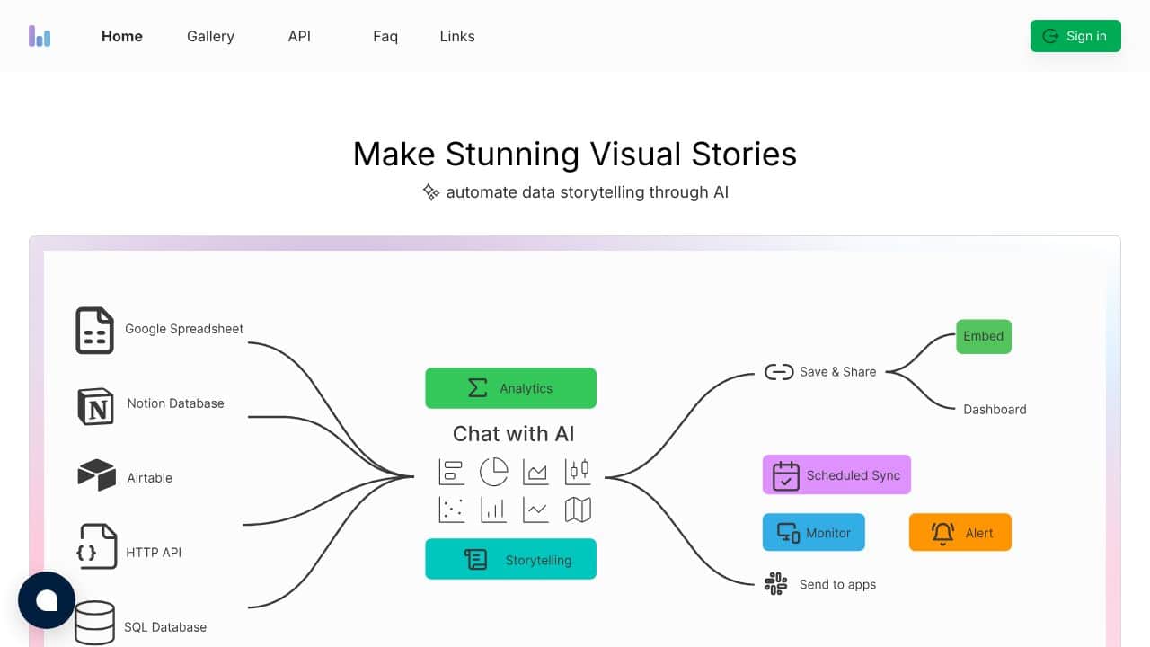
Columns is a powerful data visualization tool that transforms raw data into captivating visual narratives. By turning information from Notion, AIrtable, Google Sheets, and SQL into engaging stories, Columns makes complex datasets easy to understand and share. Its design-centric approach helps you to present data with clarity and creativity.
Columns Features
- Data Storytelling Canvas: Craft and customize unique visual narratives with ease.
- Diverse Data Integration: smoothly connect with Notion, AIrtable, Google Sheets, SQL, and more.
- Embeddable Stories: Create auto-updating visuals that can be embedded and shared effortlessly.
- Fine-GrAIned Access Control: Precisely manage sharing permissions to keep your data secure.
- AI-Enhanced Insights: Utilize advanced AI to uncover hidden patterns and translate them into stunning visuals.
Columns Usecases
- Content Creators: Transform data into engaging stories that resonate with your audience.
- Developers: Monitor and visualize project metrics in an interactive, user-friendly manner.
- Influencers: Share compelling, data-driven visuals that boost engagement across social platforms.
- Business Leaders: Present key insights and strategies clearly during meetings and presentations.
- Educators & Non-Profits: Enhance learning and report impact effectively with tAIlored data visualizations.
How Columns – AI Data Visualization Tool Compares to Alternatives
When choosing a data visualization tool, consider your primary use case, budget, and integration needs. Columns focuses on storytelling with diverse data sources, while alternatives may prioritize different aspects like chat-based building or customer lifecycle management.
| Tool | Best For | Pricing |
|---|---|---|
| Columns – AI Data Visualization Tool | Crafting and customizing visual data narratives with smooth integration from various sources. | Freemium model with free basic access. |
| DiveDeck.AI – AI Chat Deck Builder | Building presentations through conversational AI interactions and chat-based design. | Free trial available, then paid plans. |
| Zoho Show – AI Presentation Creation Tool | Creating professional presentations within the Zoho ecosystem with AI assistance. | Contact for custom pricing, likely enterprise-focused. |
| Wondershare Presentory – AI Presentation Creator Tool | Quick AI-generated presentation creation with templates and multimedia support. | Free trial, then subscription pricing. |
Best For
- Marketers creating data-driven client reports with visual narratives.
- Solopreneurs presenting business metrics in engaging, customizable formats.
- Teams needing to integrate data from spreadsheets into presentation-ready visuals.
- Content creators building educational materials with data storytelling elements.
Not Ideal For
- Enterprises requiring advanced, enterprise-grade data analytics and security.
- Users needing real-time collaborative editing with extensive team features.
- Projects requiring complex statistical analysis beyond basic visualization.
Getting Started
Start by connecting one of your existing data sources, like a spreadsheet, to see how Columns automatically visualizes it. Then, use the canvas to drag and customize elements, focusing on one key metric per visual to keep your story clear. Experiment with the freemium features before considering upgrades.
Key Limitations to Consider
- Freemium model may restrict advanced customization or export options for free users.
- Primarily designed for presentations, not deep data analysis or complex computations.
- Integration may be limited compared to specialized data platforms or enterprise tools.
- Lacks real-time collaboration features found in some competing presentation tools.
- Customization options might be simpler than professional design software alternatives.
Related Workflows and Tool Pairings
Columns fits into workflows where data needs to be communicated visually, such as creating quarterly reports, marketing presentations, or training materials. After gathering data in spreadsheets or databases, users import it into Columns to build narrative-driven visuals. This tool pairs well with data collection tools like survey platforms or CRM systems for sourcing information, and with content distribution tools like email marketing software or social media schedulers for sharing the final presentations. For teams, it complements project management tools by visualizing progress metrics in stakeholder updates.
Related tools to explore: AI PortrAIt Gen – PortrAIt Creator Tool, Alayna – AI Education Assistant, Audio-bot.com – Text-to-Speech Generator, Audyo – Text to Audio Converter, DRLambda – AI Slide Builder, Decktopus AI – AI Creative Design Suggestions, Presentations tools, Spreadsheets tools
Conclusion
In essence, Columns redefines data visualization by converting complex datasets into engaging, story-driven visuals. Its smooth integrations, creative tools, and AI-enhanced insights make it an indispensable asset for anyone seeking to communicate data with impact. Elevate your data storytelling and let your numbers speak volumes with Columns.
Pricing
Columns – AI Data Visualization Tool offers afreemium plan with optional paid upgrades. Get started for free and upgrade as needed.
Frequently Asked Questions
What is Columns – AI Data Visualization Tool?
Columns is a powerful data visualization tool that transforms raw data into captivating visual narratives. By turning information from Notion, AIrtable, Google Sheets, and SQL into engaging stories, Columns makes complex datasets easy to understand.
Is Columns – AI Data Visualization Tool free?
Columns – AI Data Visualization Tool offers a free plan with limited features. Paid plans are available for additional capabilities.
What are the best Columns – AI Data Visualization Tool alternatives?
There are many AI presentations tools available. Browse our AI Presentations tools directory to compare features, pricing, and reviews for the best alternatives.
Last verified: April 2026
Explore more: Browse all AI Presentations tools | Browse all AI Spreadsheets tools